The Visual Styles That Draw Liberal and Conservative Customers
Design can attract or repel your market, depending on customer worldview
Your customer’s first impression of your business is visual, connecting long before they read or hear a word. That visual impression - from your brand, products, or communications - is the first signal to a customer that you may or may not fit into their lives.
Customers form an intuitive response to design, which means design holds the potential to inspire acceptance or rejection before processing your product’s functional value. Aligning your design to your market’s intuition means aligning to the values that help shape it, which are distinct for liberal and conservative customers. It’s far more powerful than relying on the values and predispositions of the founder, CEO, marketing team, or anyone else who may invoke their personal preferences.
The Idea
The different visual styles of liberal and conservative customers relate closely to how the two groups perceive the present and future. Where more liberal customers seek to continuously change the present to create a better future, conservative customers are prone to preserve the present to maintain stability.
That quality of seeking a better future in liberal customers is reflected in visual styles that are typically more abstract. Abstraction in design represents a peeling back of traditional decoration to look for underlying truths that can inform a better future. As a result, liberal customer design preferences tend to be “modern,” “clean,” and “full of white space.” Or the design has a more uniform quality with elements having equal weight and less apparent structure. This makes liberal customer design simpler, which can lead to a characterization of “elegance,” a term connected to “urbanity,” which relates to liberal urban sophistication.
Conservative customers prefer visual styles that evoke tradition and stability, including hierarchical elements and structure. For conservative customers, visual styles should be “strong” and with clear order. Large amounts of uniform surface or “white space” appear chaotic to conservative customers. They prefer to impose order and structure to make the space manageable and controllable.
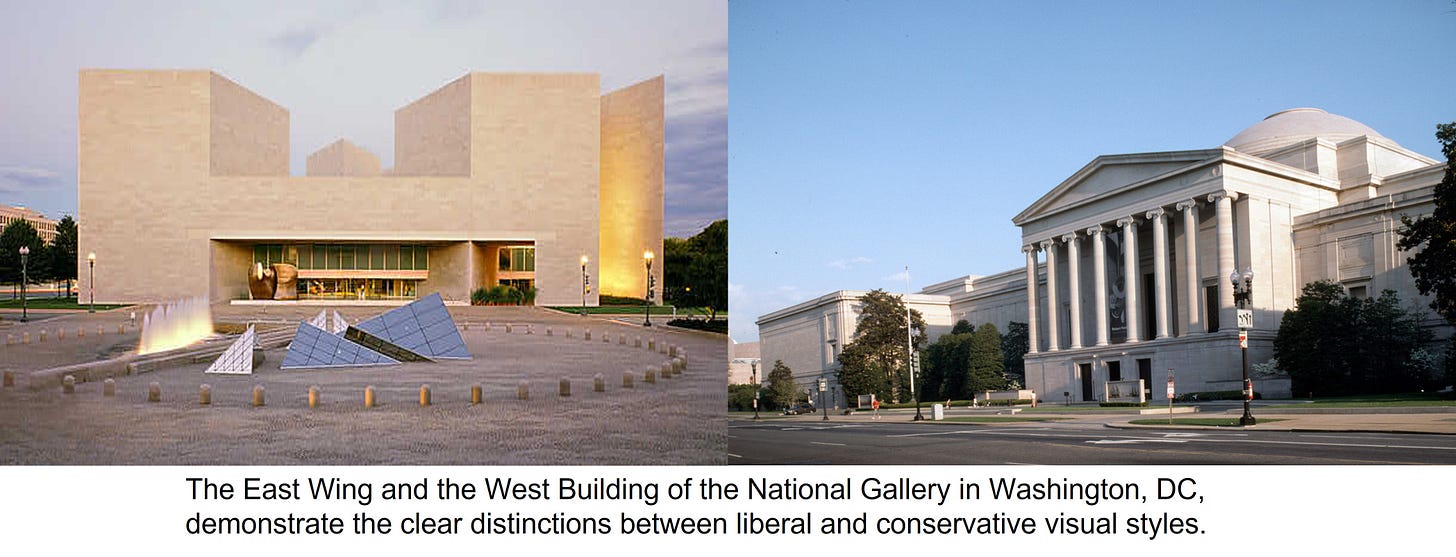
The simplest examples of the two visual styles can be found in modern and traditional art and architecture. For example, if you visit Washington, D.C., you will see the distinct differences in liberal and conservative design in the architecture and artwork of the two National Gallery buildings, which sit side by side.
There’s the more modern East Wing of the National Gallery, designed by modernist architect I.M. Pei, with its abstract forms and minimalist approach, housing artwork with a similar sensibility. The East Wing sits next to the more traditional West Building, housing more traditional artwork inside a neoclassical structure designed by John Russell Pope. On any given day, you can generally tell if there are more liberal or conservative customers for the National Gallery by comparing the crowd sizes in each of the two buildings, even if each is not exclusively liberal or conservative.
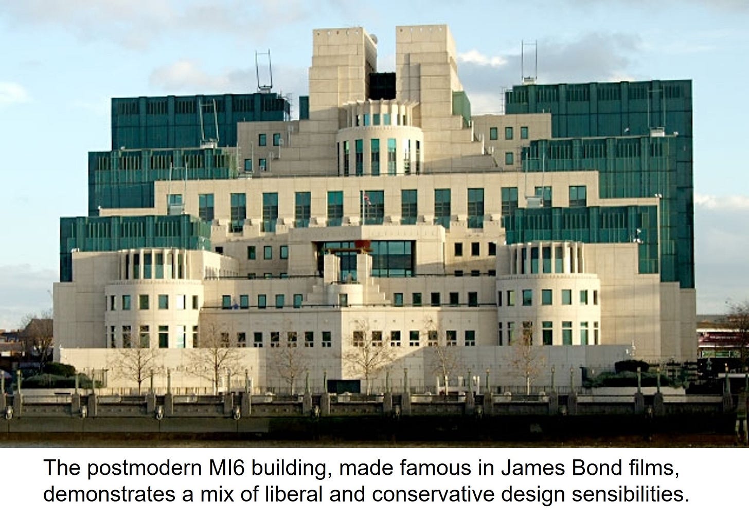
Postmodern design is one way to bridge the two sensibilities to appeal to both groups. This approach invokes a visual style that combines elements of both sensibilities, often in a playful manner. The result can look complicated, but the application can successfully bridge the divide.
The Evidence
The differences in visual style between liberal and conservative customers have historical roots from the birth of American liberal modernism in the 1920s. Liberal modernism took root in urban environments shortly after World War I, also during a time of horrific working conditions and inequalities in cities as a result of new industrial technology. The war, conditions, and inequalities inspired urban populations to reject the past along with its traditions and hierarchy because they viewed the past as the source of the problems. For this group, the focus became seeking new answers in a more egalitarian fashion.
At the same time, more rural conservatives who did not migrate to the new urban industrial centers rejected modernist urban culture with its “tempo” for a more stable, predictable life rooted in tradition. This population continued to draw its values from history and the past as they were more content with the present.
The two groups formed different cultures over the following hundred years, each with its own predispositions, including those for visual style. British social anthropologist Mary Douglas discusses the differences in visual style between the egalitarian (liberal) and positional (conservative) cultures in her book Thought Styles. She points out how those in a more egalitarian culture “reject both the inequalities of the complex hierarchy, its grandeur and extravagance.”
Douglas uses pottery and other cultural artifacts in her analysis to differentiate design differences between the two groups from a culture theory perspective. She states that more egalitarian cultures prefer “unworked finish, simple design, bare of ornament.” Douglas points out that for a more conservative or positional culture, “blank surfaces are repellent.”
Significant contemporary research confirms the analysis. In one study from Turkey, three researchers found strong links between participants who were more open to experience and a desire for surrealist art. Conversely, those with lower openness to experience strongly desired more traditional, representational art and impressionism. Openness to experience is strongly linked to a more liberal worldview across many studies in social psychology.
In another study, two researchers at the University College London confirmed the findings by studying reactions to surrealist artwork. Sensation seeking was positively correlated to a desire for the artwork, while the desire for representational art was negatively correlated. Sensation-seeking is a more liberal customer trait, as discussed in the attributes of Exploration and Self-Image.
Application
Visual styles permeate every business, including branding, store design, product design, packaging, and communications. Yet few businesses consider the worldview of their market when evaluating final design selections. The solution is to know the dominant worldview of a market to inform design decisions and avoid operating with personal preferences.
One simple example of potential market misalignment is in the business identity itself. Your logo may reflect a more modern urban liberal worldview or project something more traditional, depending on the font and design. It may seem like a small thing, but the impression you make with your business identity affects how your market perceives the worldview of your business.
Product design is another opportunity for strengthening alignment with your market to create efficiencies. A new breakthrough product must appeal to early (liberal) adopters to succeed, so a more modern urban aesthetic will work better. A more mature product may need to appeal to both groups by being neutral or intentionally combining elements of both visual styles. Or a market may skew conservative, in which case conservative predispositions for structure and order can inform design.
Communication is the most straightforward source for more substantial design alignment because updates are relatively continuous. Website layouts, customer communications, and advertising are all opportunities to resonate more with your market through intentional worldview design.
Like all distinctions between liberal and conservative customers, the differences in visual styles are tendencies within markets and won’t explain every individual. Yet, without awareness of differences, it’s far too easy to work against your market without realizing it. You have control over the visual style of your business, and you can evolve alignment over time at a low incremental cost, continuously optimizing your first market impression for growth.


